接上回“替Yahoo!捉疾”,30天的logoshow结束了,美国时间4号夜里,Yahoo!向外公布了最终新logo,一个堪称极品的品牌设计。
不出所料,衬线体被弃用,原有logo的基础架构保留,色彩保留,能玩的无非就是字体罢了。而梅姐和她所谓的设计团队居然整出了这样像废柴一样的图形来,难看至极不说,与Yahoo!现有的视觉语言格格不入,非但没有将Yahoo!品牌提升到一个新的层次,甚至已经滑入了不堪的地步。

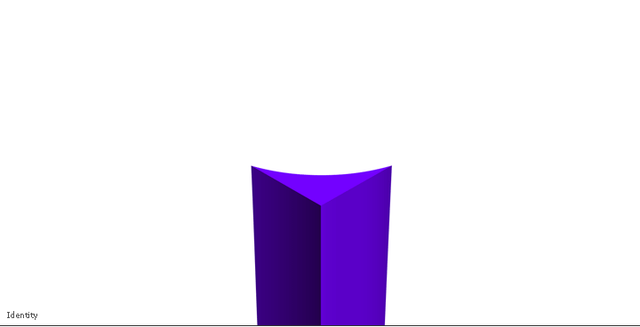
上图这个图形就是整个logo的“精华”,包括非直线、老式的浮雕效果以及比例。从目前报道的一些媒体评论来看,是一边倒的嘘声,普遍反映字体太过纤细。
1、We didn’t want to have any straight lines in the logo. Straight lines don’t exist in the human form and are extremely rare in nature, so the human touch in the logo is that all the lines and forms all have at least a slight curve.
2、We preferred letters that had thicker and thinner strokes – conveying the subjective and editorial nature of some of what we do.
3、Serifs were a big part of our old logo. It felt wrong to give them up altogether so we went for a sans serif font with “scallops” on the ends of the letters.
4、Our existing logo felt like the iconic Yahoo yodel. We wanted to preserve that and do something playful with the OO’s.
5、We wanted there to be a mathematical consistency to the logo, really pulling it together into one coherent mark.
6、We toyed with lowercase and sentence case letters. But, in the end, we felt the logo was most readable when it was all uppercase, especially on small screens.
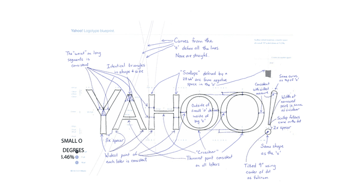
这里引用梅姐Tumblr里关于这次换标的絮絮叨叨,主要列举了6个方面的改进思路,怎么听都像是一个门外汉在指挥一支军队攻城。无论是下图的手稿还是视频里体现的都是某种有迹可循的科学劲,但是这样“一丝不苟”的设计过程未必就能解释结果的差强人意。

Leave a Reply
You must be logged in to post a comment.