
![]()
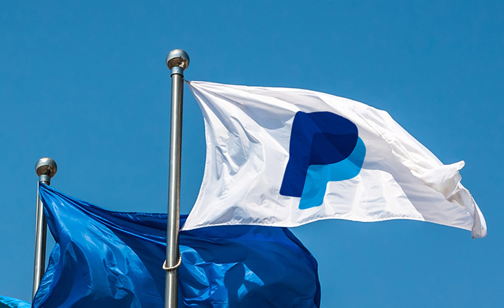
美国当地时间4月30日,PayPal(贝宝)发布了全新品牌标识,并伴随一轮全球性的品牌宣传活动。新logo由纽约 fuseproject 设计。

此次品牌重塑距离上次换标刚好7年,而1999年首次推出的 PayPal 正是在2007年更新标识,两次皆是七年之痒。或许只是笔者的牵强,不过对于此次品牌升级,PayPal 显然是已经在小屏的品牌应用上万分不爽,如果说1999年 PayPal logo 1.0 的话,2014年 Paypal logo 更新至3.0。
![]()
![]()


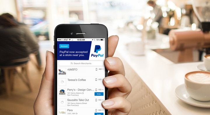
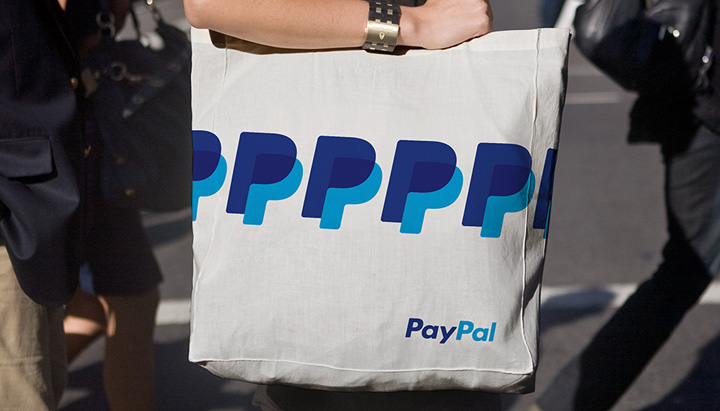
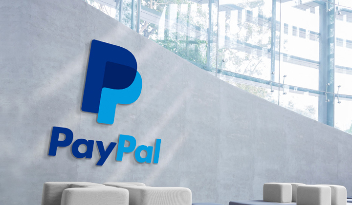
形容为 PayPal 成立以来最大的品牌变化也不为过,从纯字体 logo 转向图形 logo 的确是历史性的,在此之前,双P logo 虽然频繁出现在 App,网站 Favicon 以及支付按钮上,但其仅仅是辅助图形罢了,且有许多先天不足。而 fuseproject 设计的全新双 P logo 则更为时尚和有冲击力。
We focused on two key themes for design: connection and forwardness. For connection, we designed a new monogram with overlapping double P and transparent effect to emphasize human connection. For forwardness, we strengthened the italics that have always been a part of the PayPal logo — harking back to the brand’s heritage, and affirming a forward thinking spirit.
![]()
![]()


![]()
PayPal 1999 1.0 logo