Sotheby’s (苏富比)是世界上最古老,规模最大的拍卖行之一。 1744年成立于伦敦,现总部设在纽约。
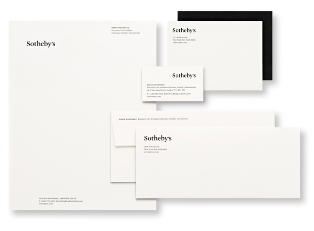
Pentagram 自2011年为苏富比重新设计网站开始,并最终推动了其品牌标识的进化——从无衬线体到衬线体的转化——由一套专属的字体设计启发灵感,树立 Sotheby’s 统一的视觉形象和有着近300年历史感。
![]()
A suite of typefaces ties the system together across various channels. Mercury is the primary typeface, with Benton Sans as the secondary font. Freight is a tertiary typeface employed for display and headlines. Miller commissioned the acclaimed type designer Akira Kobayashi of Monotype to draw custom Chinese characters for Sotheby’s Hong Kong wordmark that would pair gracefully with the Mercury.
![]()
苏富比原logo