联合利华(Unilever)
品牌原产地:荷兰+英国
行业:日化+食品
创立时间:1930年
联合利华(Unilever)由荷兰人造黄油公司与英国利华兄弟制皂公司合并成立,这两个公司在原材料、产品市场和分销渠道方面颇具相同之处,这使得合并非常成功。联合利华集团总部设于荷兰鹿特丹(Rotterdam)及英国伦敦(London)。
子品牌:夏士莲、旁氏、力士、洁诺、中华、多芬、好乐门、奥妙、凡士林,立顿、和路雪、家乐等等。
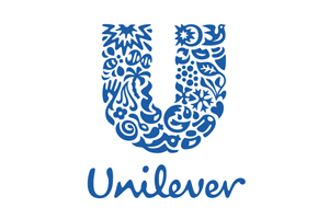
新logo由25种图案构成,分别代表一种活力和产品品牌。
Sun/ 太陽 活力的象徵,人類賴以維生的自然資源,一切生命的起源 Our primary natural resource. All life begins with the sun-the ultimate symbol of vitality. It evokes Unilever’s origins in Port Sunlight and can represent a number of our brands. Flora, Slim-Fast and OMO all use radiance to communicate their benefits.
DNA/ 基因 雙螺旋線形狀,代表生命的起源和生化科學,更是健康生活的關鍵 The double helix, the genetic blueprint of life and a symbol of bio-science. It is the key to a healthy life. The sun is the biggest ingredient of life, and DNA the smallest.
Bee/ 蜜蜂 創造力、傳播、辛勤工作,和物種多樣性,象徵環境帶來的機遇和挑戰 Represents creation, pollination, hard work and bio-diversity. Bees symbolize both environmental challenges and opportunities.
Hand/ 手 象徵感性、關心與需求 A symbol of sensitivity, care and need. It represents both skin and touch.
Flower/ 花朵 芳香,與「手」圖案組合時,代表滋潤乳液或乳霜 Represents fragrance. When seen with the hand, it represents moisturizers or cream.
Hair/ 髮絲 美麗的象徵,與「花朵」圖案組合時,令人聯想到乾淨、芬芳;與「手」的圖案組合時,則代表柔軟 A symbol of beauty and looking good. Placed next to the flower it evokes cleanliness and fragrance; placed near the hand it suggests softness.
Palm Tree/ 棕櫚樹 多樣的自然資源,也是天堂的象徵 A nurtured resource. It produces palm oil as well as many fruits-coconuts, bananas and dates-and also symbolizes paradise.
Sauces or speads/ 調味醬 代表混合與攪拌,表達混合香味、增添滋味之意 Represents mixing or stirring. It suggests blending in flavors and adding taste.
Spoon/ 湯匙 象徵營養、口味與烹飪 A symbol of nutrition, tasting and cooking.
Bowl/ 碗 滿滿一碗充滿香味的食物,亦代表即食食品、熱飲或湯品 A bowl of delicious-smelling food. It can also represent a ready meal, hot drink or soup.
S
pice and flavours/ 辣椒及調味料 代表辣椒或新鮮配料 Represents chili or fresh ingredients
Fish/ 魚 象徵食品、海水或淡水 Represents food, sea or fresh water.
Sparkle/ 火花 明亮、健康、活力閃耀 Clean, healthy and sparkling with energy.
Bird/ 小鳥 象徵自由,從瑣事中解脫,盡情享受生活樂趣 A symbol of freedom. It suggests a relief from daily chores, and getting more out of life.
Recycle/ 循環 實現持續做好環保的承諾 Part of our commitment to sustainability.
Lips/ 嘴唇 象徵美麗、美貌與品味兼具 Represent beauty, looking good and taste.
Ice cream/ 冰淇淋 休閒、愉悅及享受 A treat, pleasure and enjoyment.
Tea/ 茶 植物或從植物萃取的菁華,例如茶葉,也是成長與耕耘的象徵 A plant or an extract of a plant, such as tea. Also a symbol of growing and farming.
Particles/ 微粒 代表科學、泡沫與活躍 A reference to science bubbles and fizz.
Frozen/ 冰凍 植物是新鮮的象徵,代表個人清潔,與「衣物」圖案一起使用,則代表衣物洗護 The plant is a symbol of freshness, the snowflake represents freezing. A transformational symbol.
Wave/ 浪花 乾淨、清新與活力,代表個人清潔,與「衣物」圖案一起使用,則代表衣物洗護 Symbolizes cleanliness, freshness and vigour either as personal washing or as a laundry icon (with the shirt)
Liquid/ 水滴 代表乾淨的水和純淨 A reference to clean water and purity.
Container/ 容器 代表包裝,一瓶個人使用的乳液 Symbolizes packaging-a pot of cream associated with personal care.
Clothes/ 衣物 代表美麗乾淨的衣物 Represent fresh laundry and looking good.
Heart/ 心 象徵愛、呵護與健康 A symbol of love, care and health.
我们现在处处可见的联合利华的logo是2004年推出的公司标识,它可以在你使用的洗发水、洗衣粉、牙膏、奶茶以及冰淇淋的包装背面被找到。在联合利华官方网站上这样写道:
“一个字母“U”,诞生于20世纪20年代的一个小小的肥皂生产商;另一个字母“U”则脱胎自21世纪初一个在全球88个国家(地区)拥有300多家分支机构、234,000名员工的跨国巨擎。贯穿两者的,却是同一种延续了75年的梦想。”
的确如此,很久以来,在同等条件下,选择联合利华而不是宝洁,一如百事之于可口可乐。原因扑朔迷离,我自己也不清楚,仅凭一种冥冥中的指引。一种品牌本身的亲切感或者对我的适合。
联合利华的新logo也增强了这种感受,它清新自然,健康平和,更健康富有活力。